Product Complexity & Intimidation
AI tools can often feel technical or overwhelming to new users, creating hesitation before users fully understand the value of the product.
The goal of this project was to design a landing page for an AI assistant that users can download and set up on their computer.
A key challenge was communicating how the product works in a way that feels approachable and easy to understand, as AI tools can often feel complex or intimidating for first-time users. The experience needed to explain functionality clearly while encouraging users to confidently move toward action.
The project combined a futuristic visual direction with a structured and guided layout designed to simplify information, reduce friction, and make the experience feel intuitive from the first interaction.
AI tools can often feel technical or overwhelming to new users, creating hesitation before users fully understand the value of the product.
Users may struggle to understand what the assistant actually does or how it works, making it harder to build confidence and encourage action.
During the early stages, different layout directions were explored to determine how to present the product without overwhelming users.
Initial approaches leaned toward denser visual compositions and more experimental layouts. While visually interesting, these made information harder to scan and reduced clarity around how the product worked. As a result, the direction shifted toward a more structured and guided experience that breaks information into smaller, easier-to-understand sections.
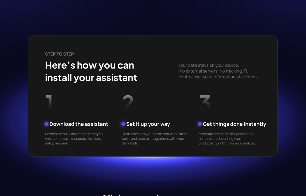
The focus became clarity over visual complexity, progressively introducing setup steps, functionality, and product benefits in a way that feels more digestible and approachable.
The landing page was intentionally structured around a gradual learning experience, helping users understand the product step by step while reducing cognitive load.
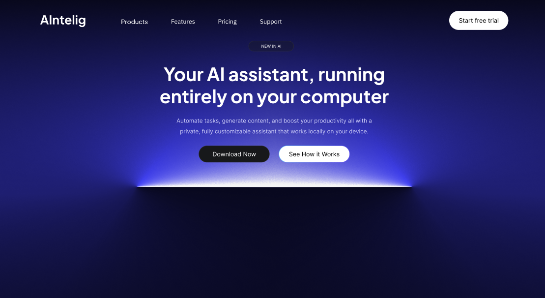
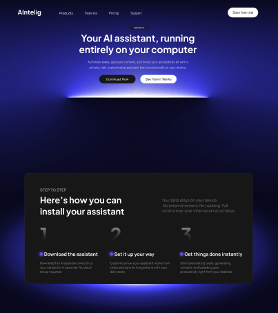
The experience begins with a hero section that introduces the AI assistant and establishes context. From there, users move into a “How it Works” section where setup is broken into simple and approachable steps, making the product feel easier to understand and less intimidating.
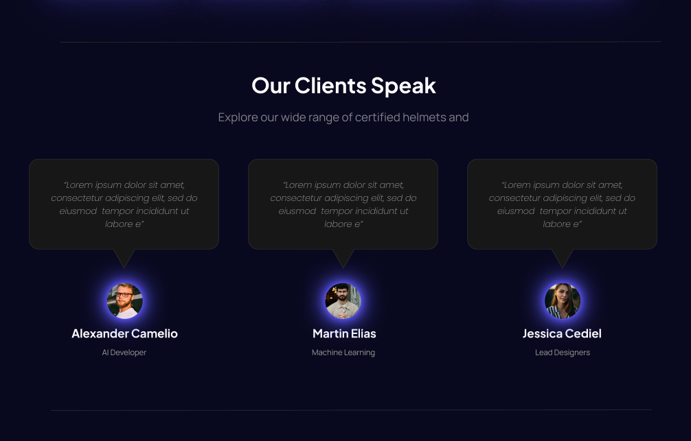
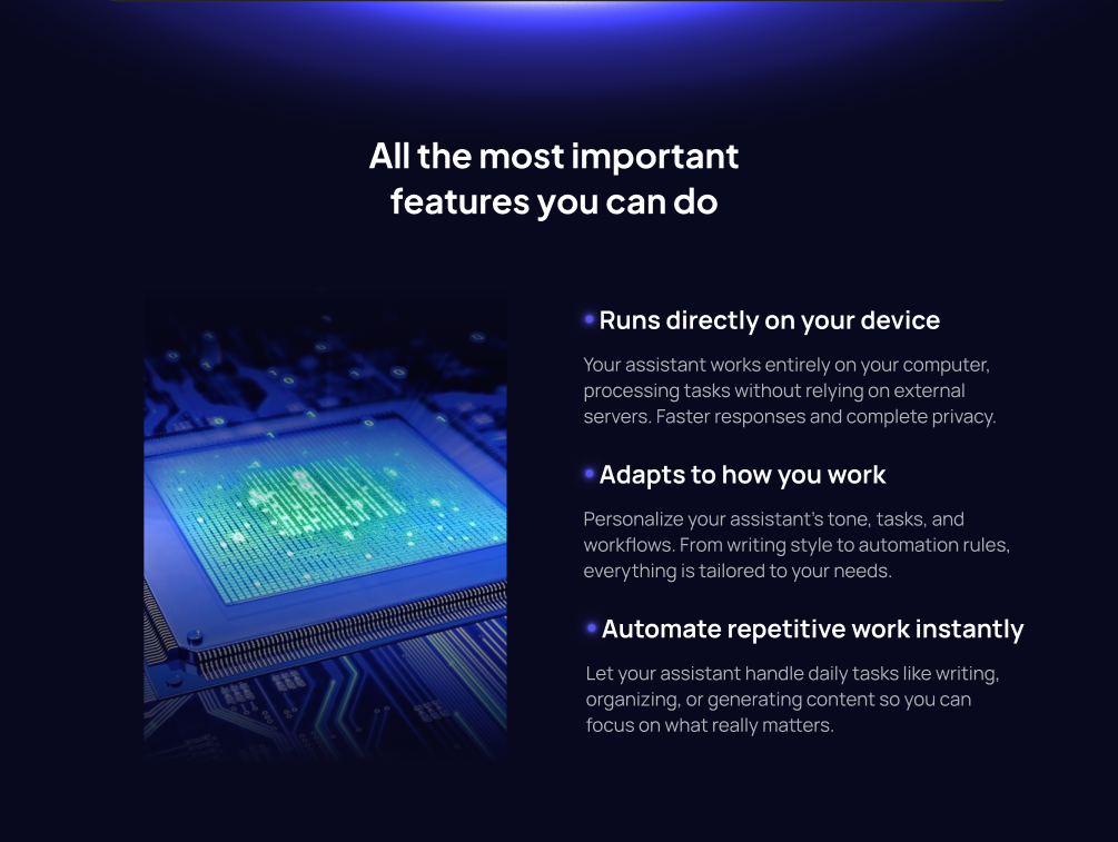
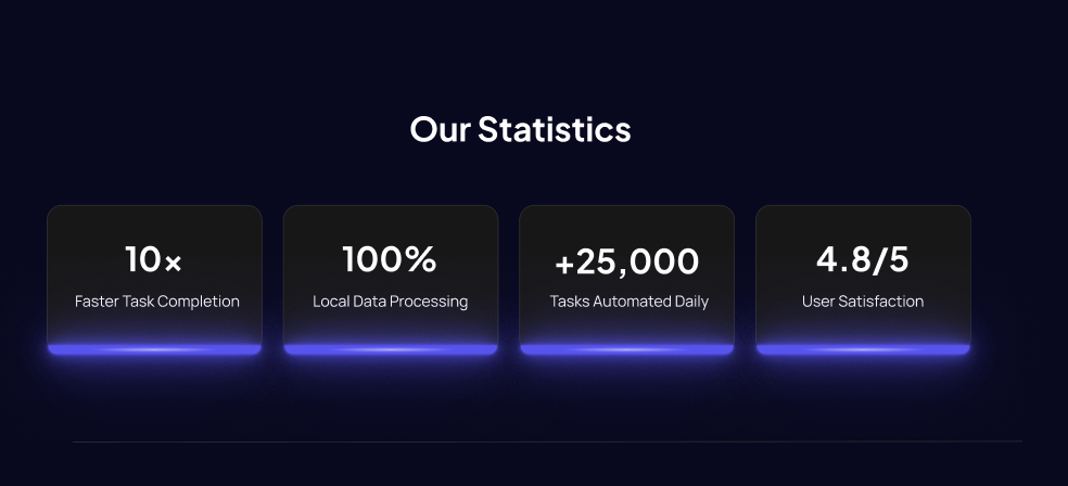
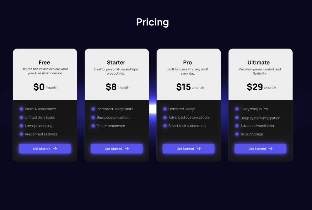
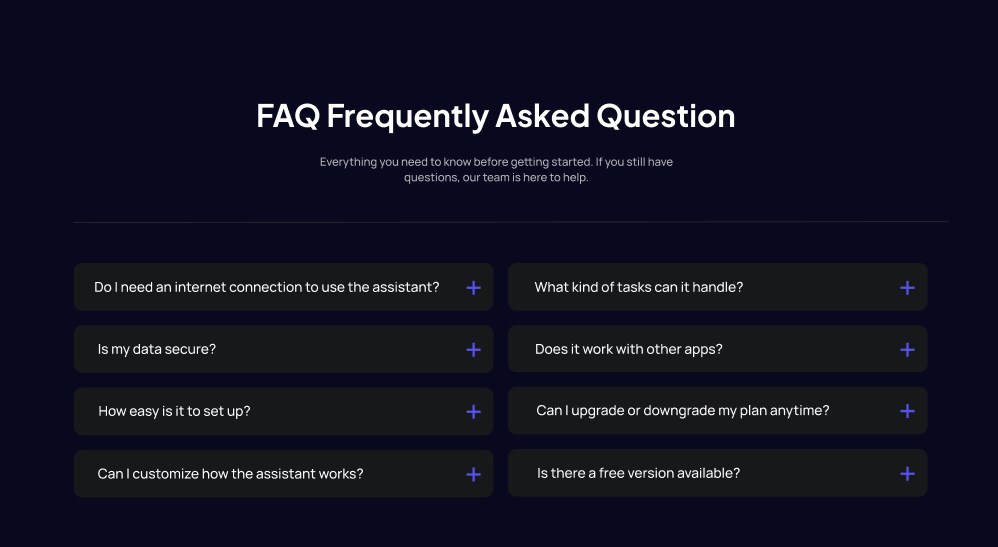
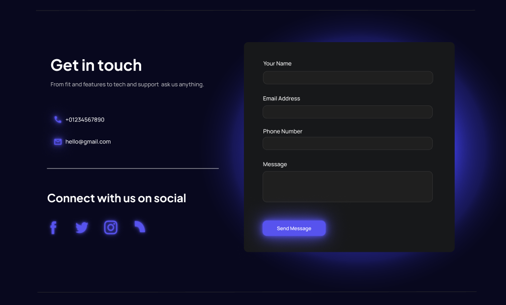
A features section follows to explain the assistant’s practical value and functionality, helping users connect product capabilities with real use cases. Additional sections such as statistics, testimonials, pricing, and FAQs work together to reinforce trust, clarify differences between plans, and reduce uncertainty before action.
By organizing information progressively, the structure prioritizes understanding before commitment, helping users feel informed and confident throughout the experience.
Because AI tools can feel technically intimidating, setup information and functionality were intentionally divided into smaller sections to reduce overwhelm and make the product feel easier to approach for first-time users.
Early explorations included a section focused on the broader problem space where AI assistance could help. However, this was removed to avoid adding friction before users understood the product itself. The final flow prioritized product understanding and action over additional context.
Consistent button treatments, card styling, and interaction patterns were repeated throughout the experience to create predictability and visual cohesion, making information easier to scan and understand.